How to Draw 60s/70s Groovy Lettering – Step by Step
Recently, I got into trying to illustrate letters in the wavy, groovy 60s and 70s art style. I find it really relaxing to make these drawings, and thought I’d share some of the things I’ve learned along the way.
Here’s a how-to on how I do my lettering compositions!
Step 0
Check out some 60s and 70s lettering inspiration on Pinterest to get an idea of what you might want your lettering to looks like.
Step 1
Decide what you want your lettering to say!
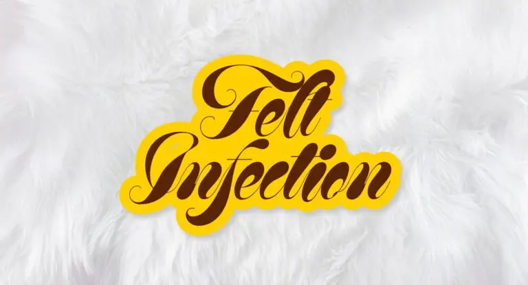
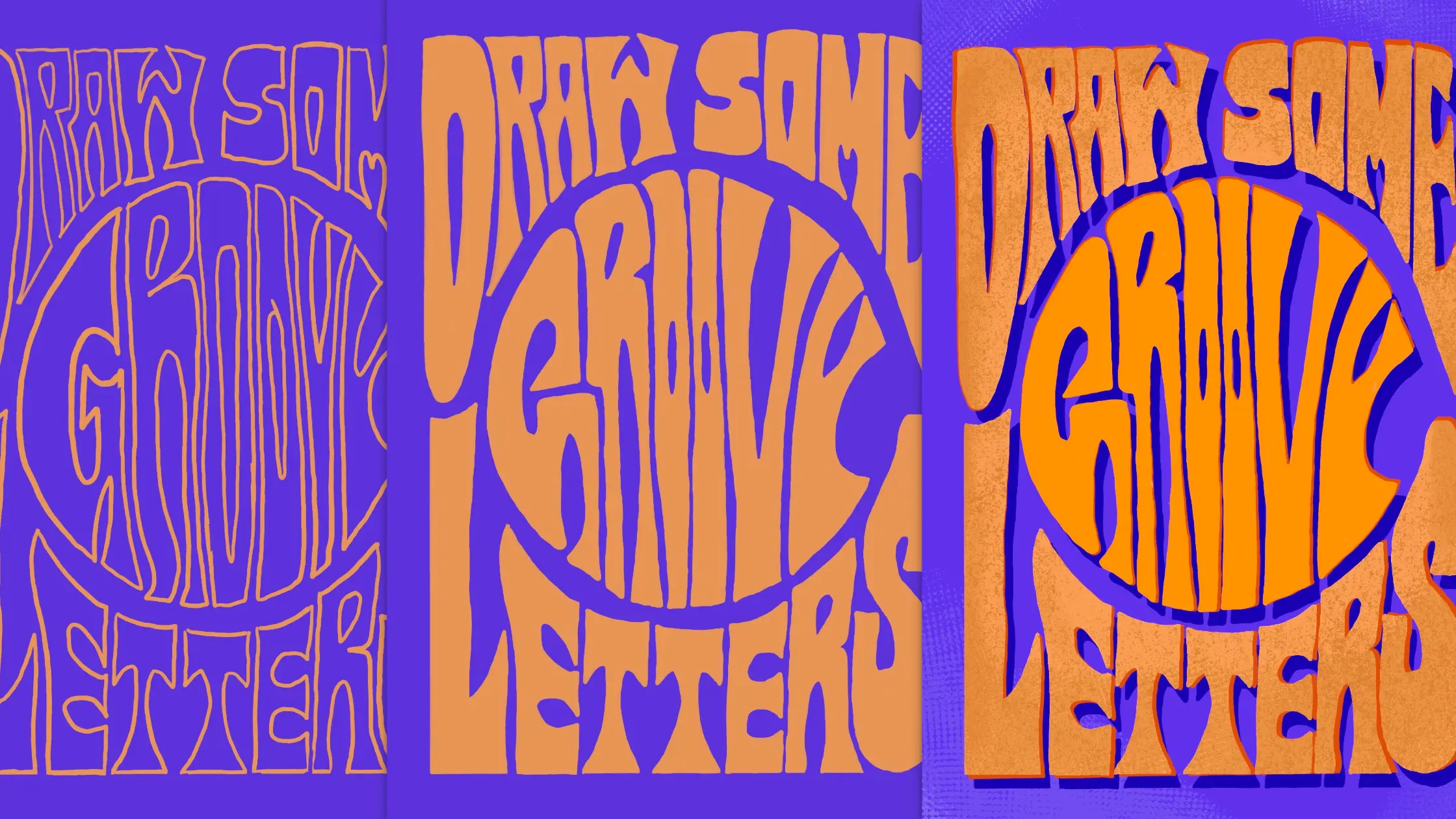
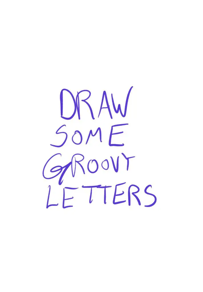
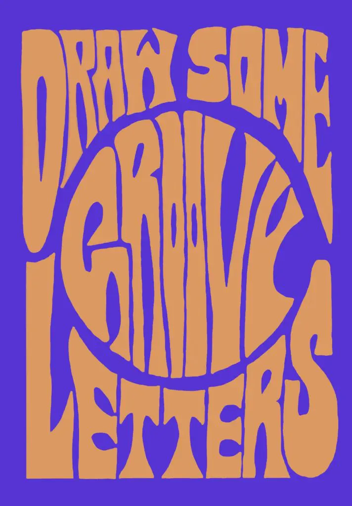
I’ll be demonstrating with some lettering that says ‘Draw some Groovy Letters.’
Step 2
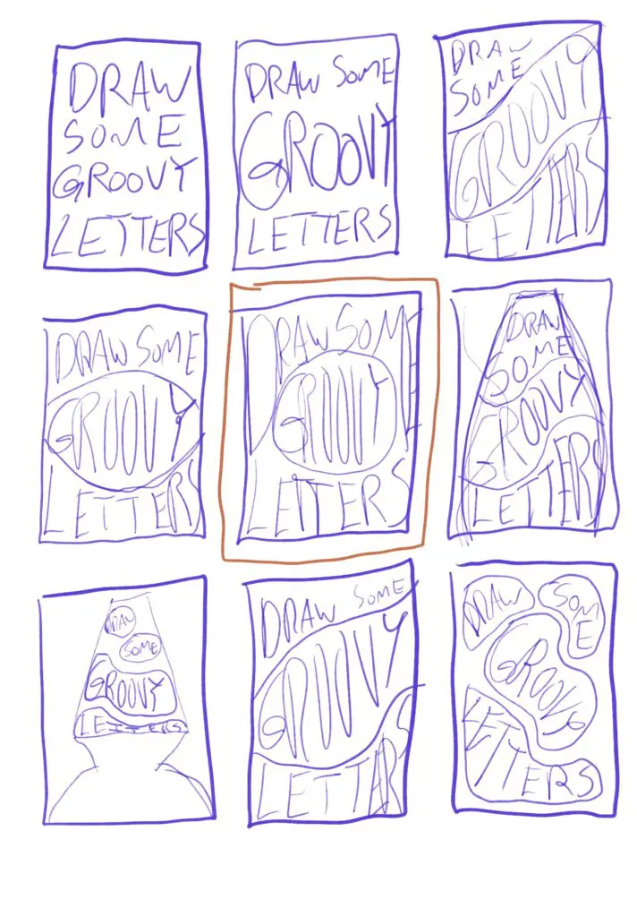
Draw a bunch of thumbnails. I find it helpful to decide on a basic shape I want the letters to fit into – square, rectangle, circle, etc. If you’re doing a poster, you can use the poster dimensions.
Try out different layouts for the lettering using your own handwriting. Just get a general sense of composition at this point, all the detail will be completed later. You can also try out just adding in large shapes where you want to eventually put the words/letters, to get a sense of composition.
Once you have a composition you like, you’re ready for Step 3.
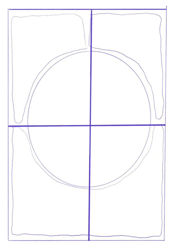
Step 3
Rough in your layout. Draw out the border of the composition, the large shapes where lettering will go, and add in guides for the center of the composition horizontally and vertically.
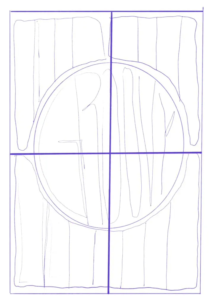
Step 4
Rough in your lettering. I often draw rectangle-ish shapes to represent where each letter will go (double check your spelling here!), and plan where letters will drip into empty space or mold around another element. This is also the time to decide if you want the lettering to flow in a specific direction – should all the letters be pushing each other toward the right? The left? Flowing downward instead?
If you have multiple lines of letters, this is also where you can add in baseline guides for where the bottom (and top if you want) of the letters will line up.
Step 5
Start lettering!
Using the basic shape you’ve made for each letter, start sketching in how the letter will actually look. A popular style of lettering is characters with wide ‘serif’ ends that curve down to narrower stems. One of the key elements is that the letters affect each other, filling in empty space left by other letters or curving around wide letters.
Keep sketching until you like the way your letter outlines are looking.
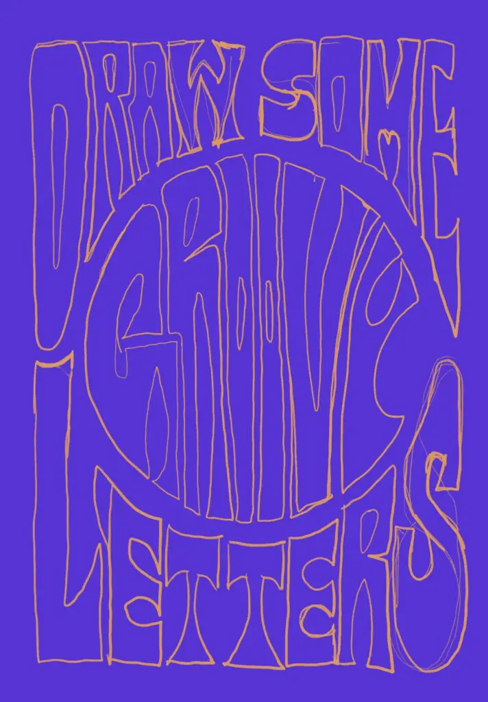
Step 6
Now’s the time to decide how you want to finish up your lettering. If you are working on paper, now is a good time to bring your sketch into a vector graphics program (PenPot is free!) and start working on your composition there. This makes it easy to clean up lettering as you go and try out colors.
If you’re using a program like Procreate, you can clean up and fill in the letters within that program and it will be easier to use the Trace functionality in Illustrator to move your lettering into a vector format, if you’d like.
Either way, this is the step to finalize the outlines of the letters and fill them in!
Step 7
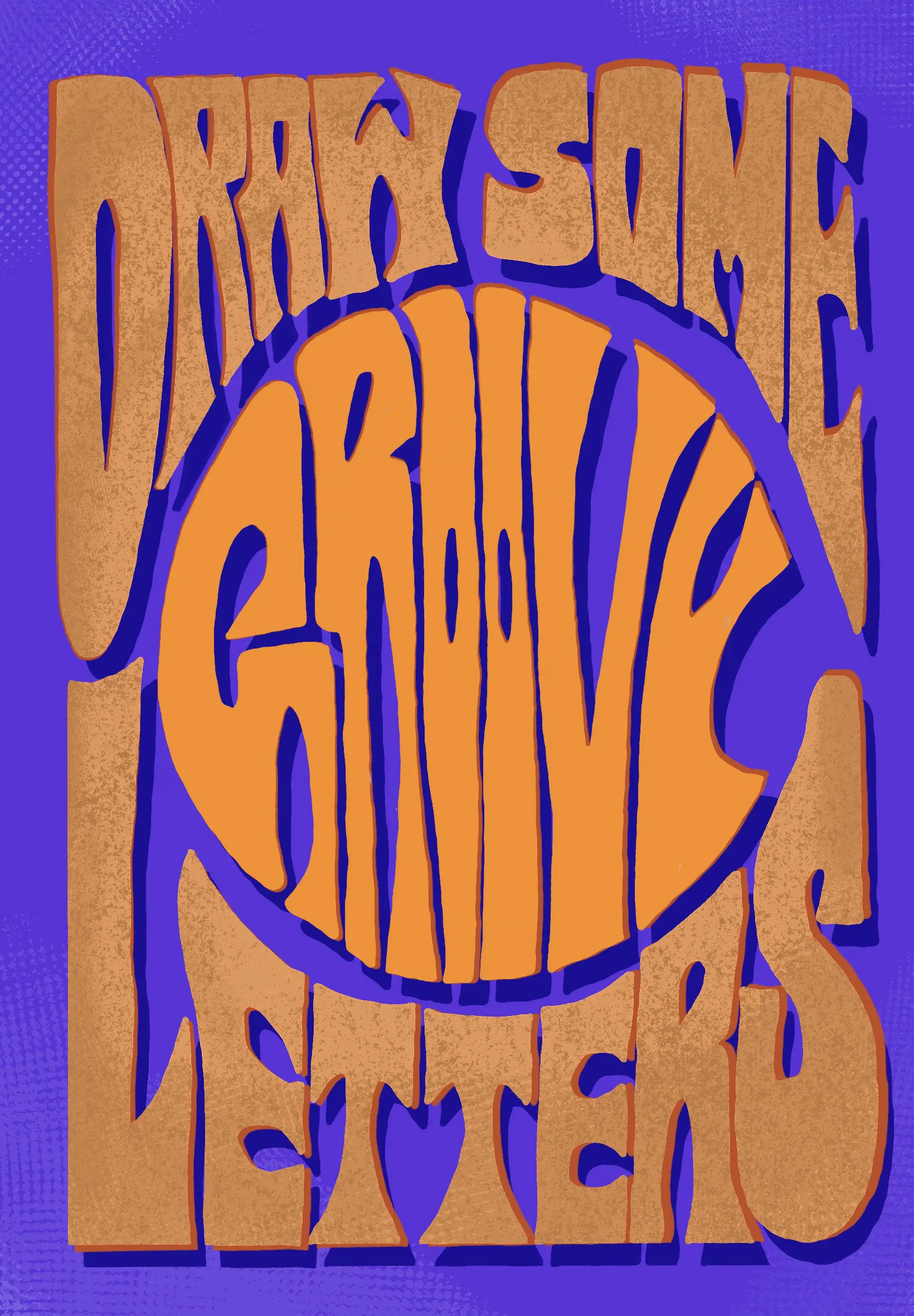
Add color, a drop shadow, texture, or anything else you want!
To add a drop shadow, duplicate your lettering, change the color, and put it behind the original lettering. You can then update this drop shadow layer however you want, but duplicating the lettering saves some time drawing everything out.
Step 8
You’re done! Admire your work.
Bonus Tip:
If you want to add an image to your composition, it’s helpful to choose the image before you start roughing in the layout. This lets you add the image and work the letters around it.
You can use a tool like halftonemaker.com to give your image a real old-school print look!